New shop logo

Hoosier Daddy

Earache my eye...
Ok, you guys know me well enough to give me some honest feedback, and I can take it. But I already got printed it out in vinyl lettering large enough for a 3' x 4' sign. Actually my old Boss did it for me before I left. Have enough for 3 signs (or two, one being front and back to see at the corner of my road) and then 4 more that are car license plate size.
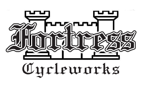
Anyone who has done swapping with me knows my my last name is Fortress. I started the logo with a single Chess Rook image and went from there.
Granted I am not to the level of opening my own shop yet, but with 5 bikes of my own now and another 5 more in the shop that AREN'T mine, I thought I should at least think about it... So introducing the new shop logo.


I like it ! And I agree with Desmo, if you have 5 bikes in your garage that don't belong to you either have a custom cycle shop, hopefully with paying customers, or a chop shop in which case you wouldn't be advertising.
 
Nice logo. And i must have a serious problem...13 of my own and three that aren't mine....ouch.
 
Only cause you asked for critique.

If you're using this as signage, the font will be difficult to read. I don't know if it's the way it's been resized, but the font is jagged, like it's not aliased. This can be caused by not using a vector file. Lastly, the kerning (spaces between letters) is off. Most noticeably between the F and O.

Here's an example, if you like it, it's yours.

wVJPc.png

I have it in a vector format as well, if your printer needs one.
 
It;s only good if you have a playhouse i can have fun in (no shoes of course) while i wait for you to fix my bike.
 
axeugene27 said:
It;s only good if you have a playhouse i can have fun in (no shoes of course) while i wait for you to fix my bike.

Bouncecastle
Cycleworks

Fuck yeah
 
axeugene27 said:
It;s only good if you have a playhouse i can have fun in (no shoes of course) while i wait for you to fix my bike.

Fix said:
Bouncecastle
Cycleworks

Fuck yeah

Now that's some funny shit!
I agree about the font, but I want something old English looking. This was the best of the 3 choices. The Vinyl lettering cut smooth not jagged and is straight not curved like I wanted, maybe it will be easier to read.
 
Back
Top Bottom