honda/Matchless emblem

1976cb356

Twins FTW
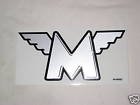
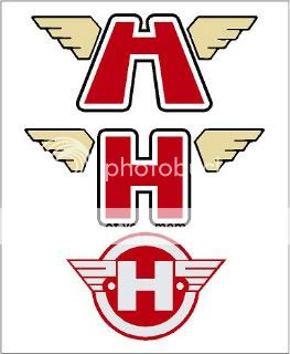
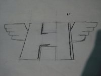
Hello DTT members, I have an idea that I really want to do, just wondering if u guys would think it would be cool and not a total rip off, or poser thing. I like the matchless emblem and I was thinking since my tank is just going to have pin stirps and knee grips, why not have a cool custom emblem. I want to make a bold H like the bold M with wings just like the matchless emblem and put them on both sides of the tank. I really think this would be original and look authntic. Tell me what you guys think. No opinon will be considered rude, unless you go out of your way. ;D Thanks
 

Attachments

  • 140.jpg
    140.jpg
    2.5 KB · Views: 976
Honda has the single wing style logo. To keep within its parameters and double up would be pretty cool.

hondalogow.jpg

By weslake at 2011-09-09
 
Yea I was pretty close to putting the single wings on it, but then it would seem like I totally got the idea from milehigh ;D . it would be cool with the double wings, I am just stuck on this idea. Matchless has been one of my favorite motorcycle companies too. Thanks for the suggestions
 
Thats what I meant. Sorry I didn't explain it correctly. I meant to use the Honda wing on both sides of an H.
 
Hoofhearted said:
Thats what I meant. Sorry I didn't explain it correctly. I meant to use the Honda wing on both sides of an H.
Ohhh ok, yea I will try to work them in and see how they look. Thanks again
 
I like the idea but that rendering leaves a little to be desired for my taste - it's a little too "computer squared off" looking, if that makes sense...mainly just the wings though, the M seems to have some smooth lines on the transitions.

See the "feather" part of the Honda wing and how they are curved, just makes it look more polished to me.
 
camit34 said:
I like the idea but that rendering leaves a little to be desired for my taste - it's a little too "computer squared off" looking, if that makes sense...mainly just the wings though, the M seems to have some smooth lines on the transitions.

See the "feather" part of the Honda wing and how they are curved, just makes it look more polished to me.
I get what you r saying, but that is one of the reasons I like it so much, simple and nostalgic. I am going to draw out both, or draw out the simplier one and then do one on the computer.
 
Uncle Earnie rode a cafe'd W650 with an alloy tank to my Pop's picninc a few years back. He had a winged "W" on his tank. Very cool. I guess he designed it and had it printed/cut in vinyl. I miss that guy.

Edit. I found a pic.
images7.jpg
 
Wow, did u make those? I was thinking about making the H slant to match the lines of the wings, like the M. I wanted to make one like the pic I had but now you are making me think. I have seen those in black and white also, too many choices, haha. I am really stuck on silver and black, since my tank will be dark green and gold pinstrips. thanks your talent, I tried on the computer and I am just terrible.
 
Heres my very very rough sketch of my honda/matchless emblem, I mess around with the H a lot on my other ones and this is the best I could make it so far. I am pretty embarrassed of my rough sketch since most of you are putting more effort in this than me. Thanks guys, tell me your opinions please
 

Attachments

  • veryrouchhondamatchless.jpg
    veryrouchhondamatchless.jpg
    103.4 KB · Views: 280
The first one looks too 1980's superhero show. the 2nd one looks unfinished. the 3rd one is perfect. absolutely love it.
 
yes I made them. I like the third one the most too, but I was just throwing out some ideas.

On your rendering are the lines in the H representing a bevel? Or an outline?
 
Back
Top Bottom