Maybe keep the new license holder but lower the seat side to completely hide the frame rails and create the stepped crease that continues the tank lines? Maybe also rounding over the bottom transition area between the seat and rear hump so it is more smooth/gradual than a point?hdscarbro said:I like your idea and it wouldn't be too hard to do either. It's painful to think about cutting off the license holder at this point. Gonna think on it for a bit.
We noticed you are blocking ads. DO THE TON only works with community supporters. Most are active members of the site with small businesses. Please consider disabling your ad blocking tool and checking out the businesses that help keep our site up and free.
You are using an out of date browser. It may not display this or other websites correctly.
You should upgrade or use an alternative browser.
You should upgrade or use an alternative browser.
1982 Yamaha XS400 Seca
- Thread starter hdscarbro
- Start date
hdscarbro
Active Member
zap2504 said:Maybe keep the new license holder but lower the seat side to completely hide the frame rails and create the stepped crease that continues the tank lines? Maybe also rounding over the bottom transition area between the seat and rear hump so it is more smooth/gradual than a point?
Can't lower the seat, the electronics are mounted under it.
")
I meant to lower (i.e., add more material to) the sides of the seat - where it overhangs the frame, not the seat height itself.hdscarbro said:Can't lower the seat, the electronics are mounted under it. I cut the license holder off of the seat today and made an aluminum bracket to hold the plates. Gonna work on the front part of the seat next.
Sometimes when I am designing bodywork, I end up staring at it for so long I lose track of what I had in mind to begin with and I find it helpful to keep in mind the basics. Keep in mind you are not actually starting from scratch. You are using a stock tank, and that most prominent feature can help guide you. If you want complimentary bodywork, you should keep in mind the basic characteristics of the tank. Look at your tank, and then look at your seat and see if it looks to you like it goes with it. Looks like the basic shape you already have for the seat cowl goes well with the tank, so if you keep the edges similar, you will be good to go. You have some pretty hard body lines in the tank, and usually it is good to mimic these in the rest of the bodywork so it looks like it was all made to go together, instead of just mixed and matched. That strong angled joint between the seat and tank, the two strong curves on the tank, one that defines the lower edge and the other defining the top and side panels are key elements. These are the sort of things that should be reflected in the tail section. Other elements are how round or flat the shape of the tank is. Some tanks are very round in form and need a round tail section to go with it. Your tank is numerous gently curved "flat "elements joined by some fairly small radius body lines, and likely continuing this scheme will look good on your bike. A lot of people have simply taken another stock tank for their bike, cut the back end off of it and made it into a tail section. Usually this looks pretty good - for good reason! On your bike, the original bodywork was directly matched up with the back of the tank - actually not bad for bulky stock bodywork. If you are keeping your seat bodywork right up against the tank, you probably should think about making it match exactly there, even if it is a tiny strip. Think about all the Honda CB900 customs out there that have the same scheme regarding the back of the tank. That one spot usually makes or breaks the aesthetic of the bike.
Xb is right about putting all the parts together - they all impact the end look. However, keep in mind that to some degree, if your frame is going to be black, and your bodywork some contrasting color, the frame will become more of a background, and the need to conceal it may become much less important. A LOT of stock bikes have unbelievably hideous amounts of frame clearly showing, but your eye focuses on the more prominent bodywork.
Xb is right about putting all the parts together - they all impact the end look. However, keep in mind that to some degree, if your frame is going to be black, and your bodywork some contrasting color, the frame will become more of a background, and the need to conceal it may become much less important. A LOT of stock bikes have unbelievably hideous amounts of frame clearly showing, but your eye focuses on the more prominent bodywork.
hdscarbro
Active Member
A while back, I posted photos of the seat with the extended tail and received several suggestions for refinement:
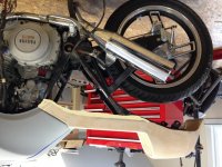
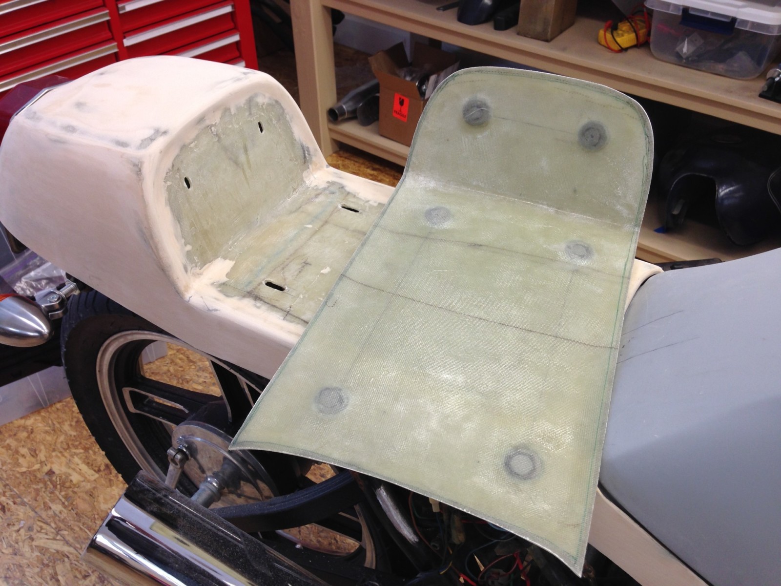
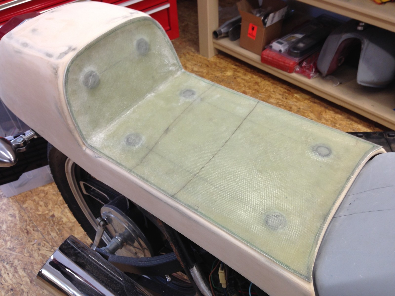
Here's what the seat looked like before refinement:
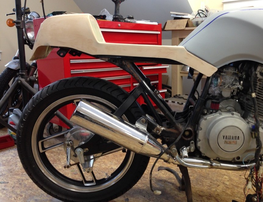
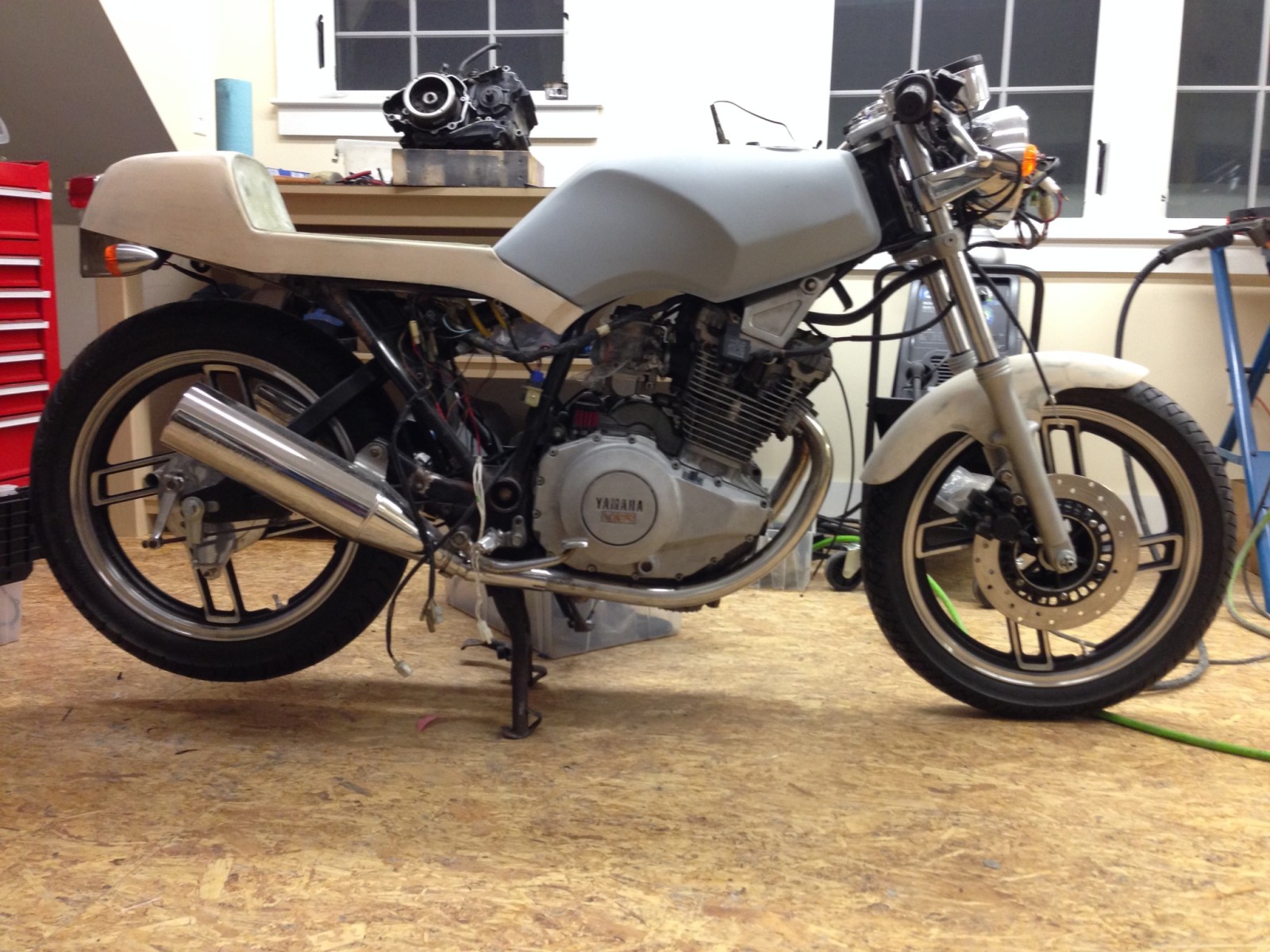
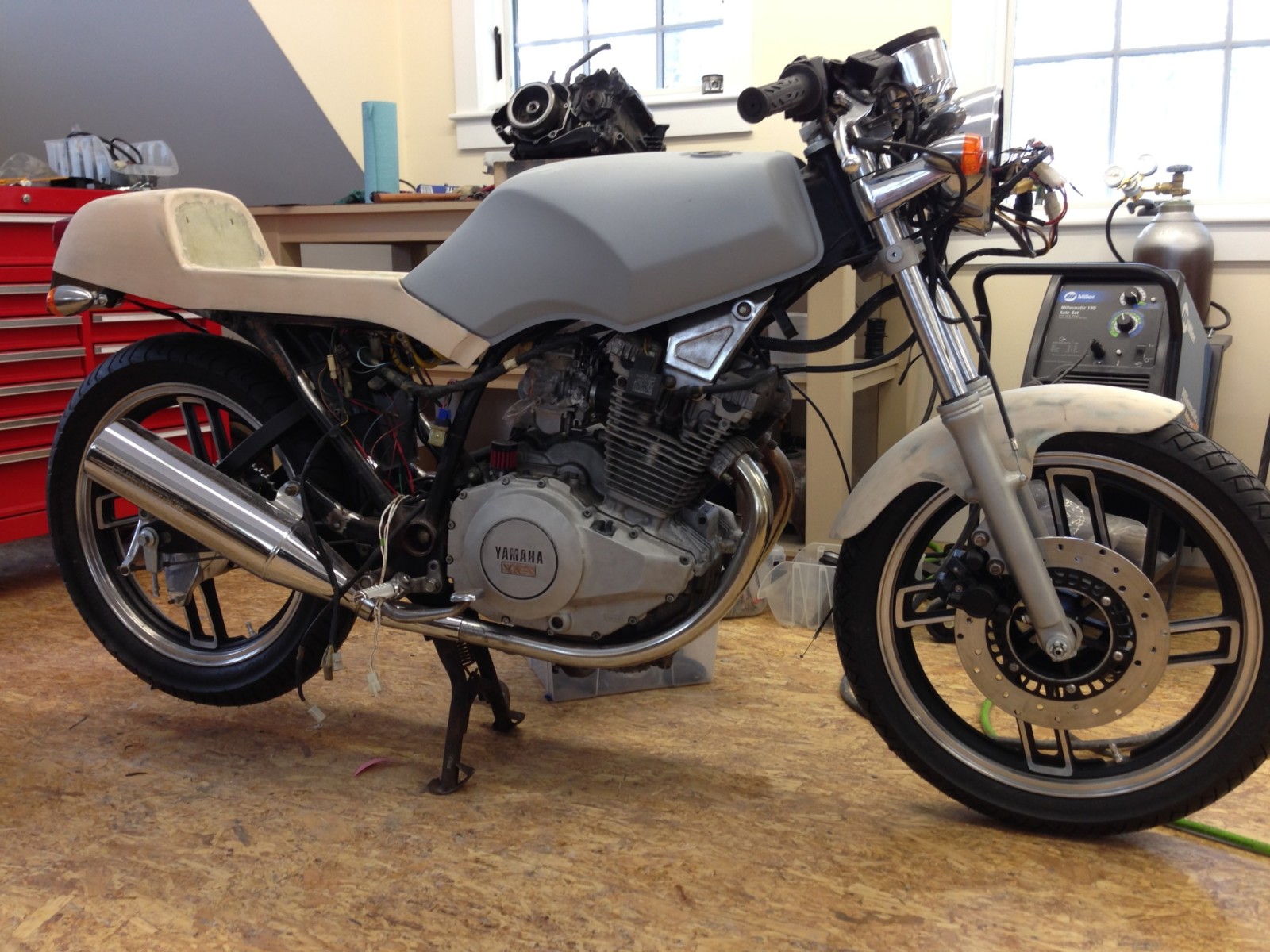
And here is it now:
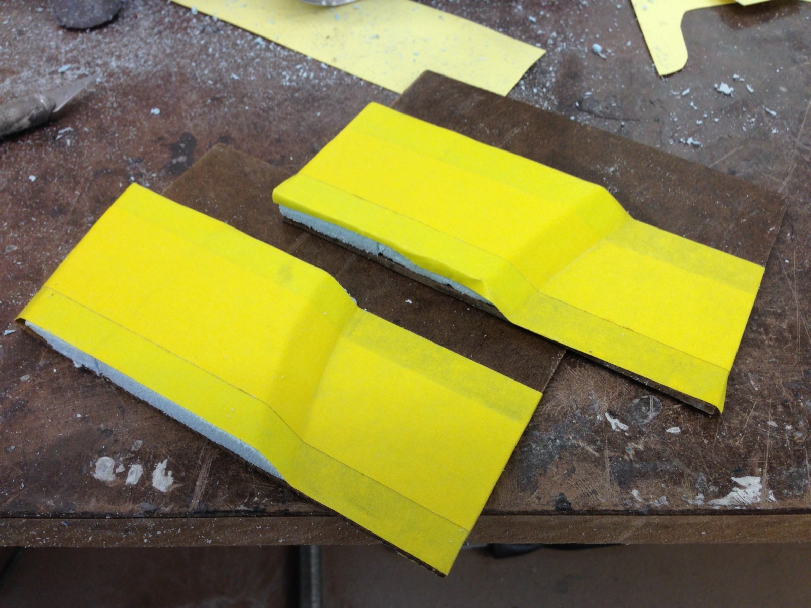
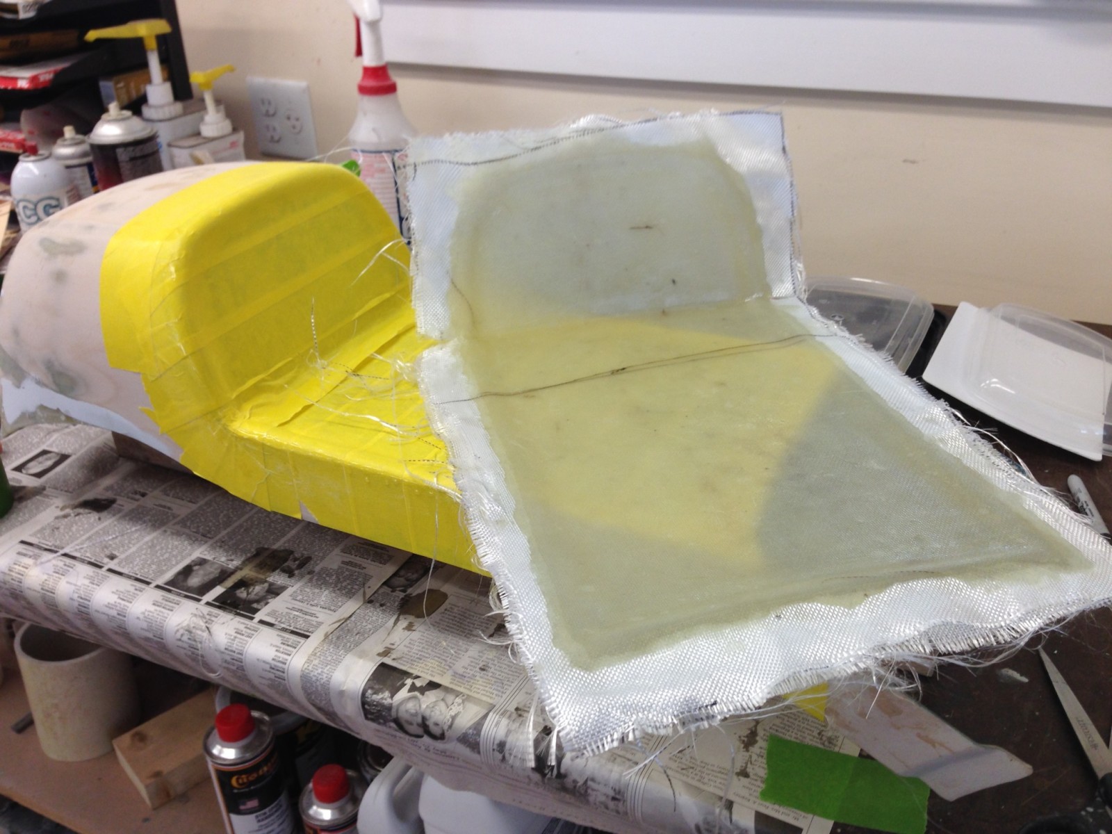
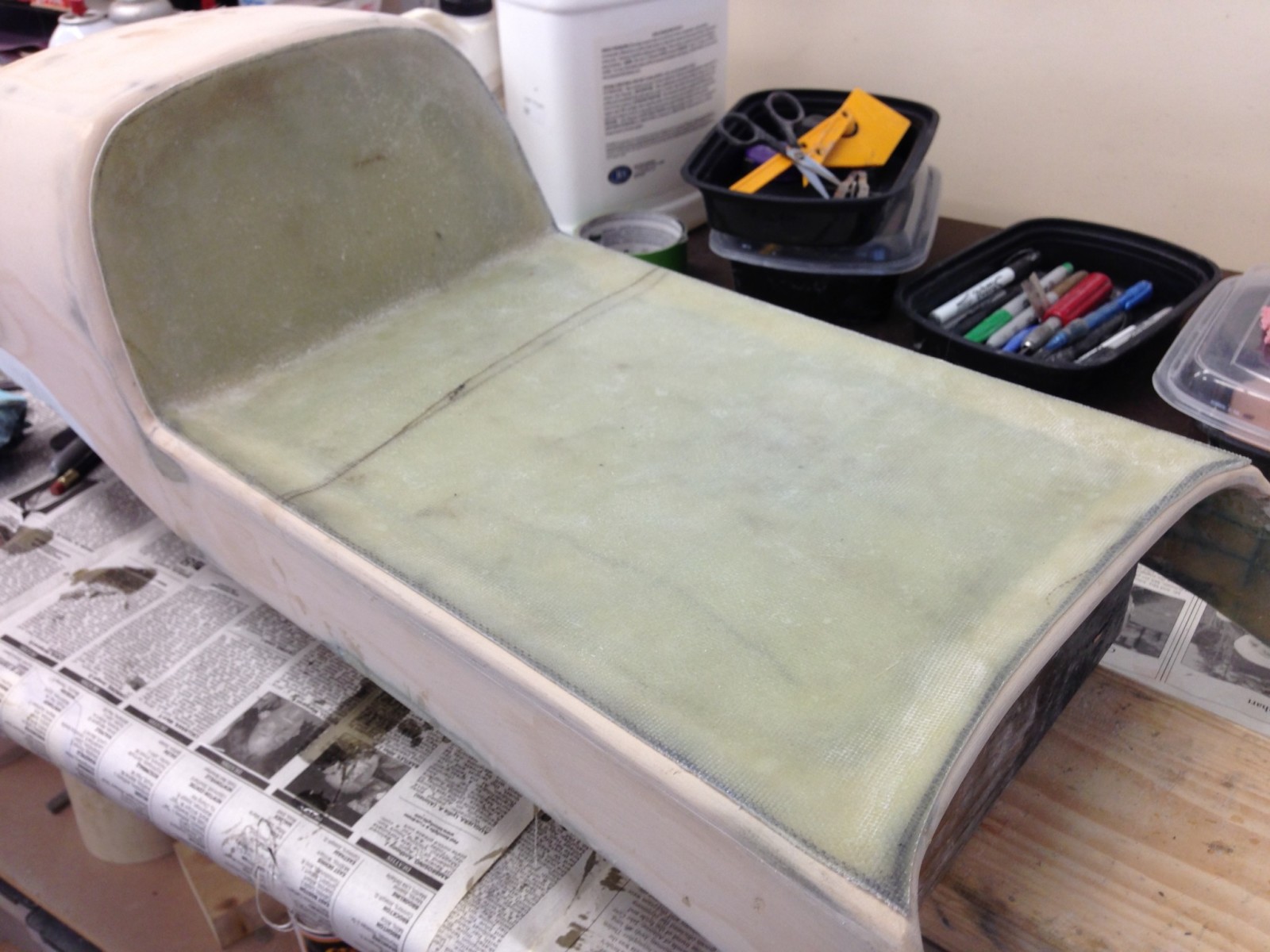
I had to extend the sides of the seat in the tail area and then retrim the bottom. At the front, I fabricated stepped tips for the seat "wings" and spliced them in place.
The form for the stepped tips was made from fiberboard scrap, styrofoam and tape.
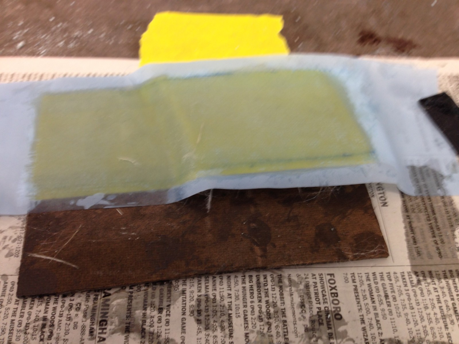
One of the tips curing.
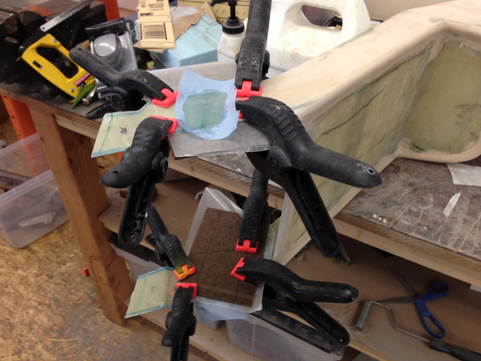
The tips clamped in place and curing.
- The front of the seat should be shaped to blend with the gas tank where the two come together.
- The seat tail looked awkward because the shape and integrated license plate bracket didn’t mesh with the rest of the bike.
Here's what the seat looked like before refinement:
And here is it now:
I had to extend the sides of the seat in the tail area and then retrim the bottom. At the front, I fabricated stepped tips for the seat "wings" and spliced them in place.
The form for the stepped tips was made from fiberboard scrap, styrofoam and tape.
One of the tips curing.
The tips clamped in place and curing.
hdscarbro
Active Member
The seat pan was made by first covering the seat area with masking tape and giving the tape several coats of wax. Four layers of fiberglass were then added and allowed to cure. After curing, the pan was removed and trimmed. With the pan in place 6 holes were drilled through the pan and seat for fastening bolts. I made the fastening bolts by welding the thread part of old allen head screws to fender washers. These were epoxied in place and covered with five more layers of fiberglass.
hdscarbro
Active Member
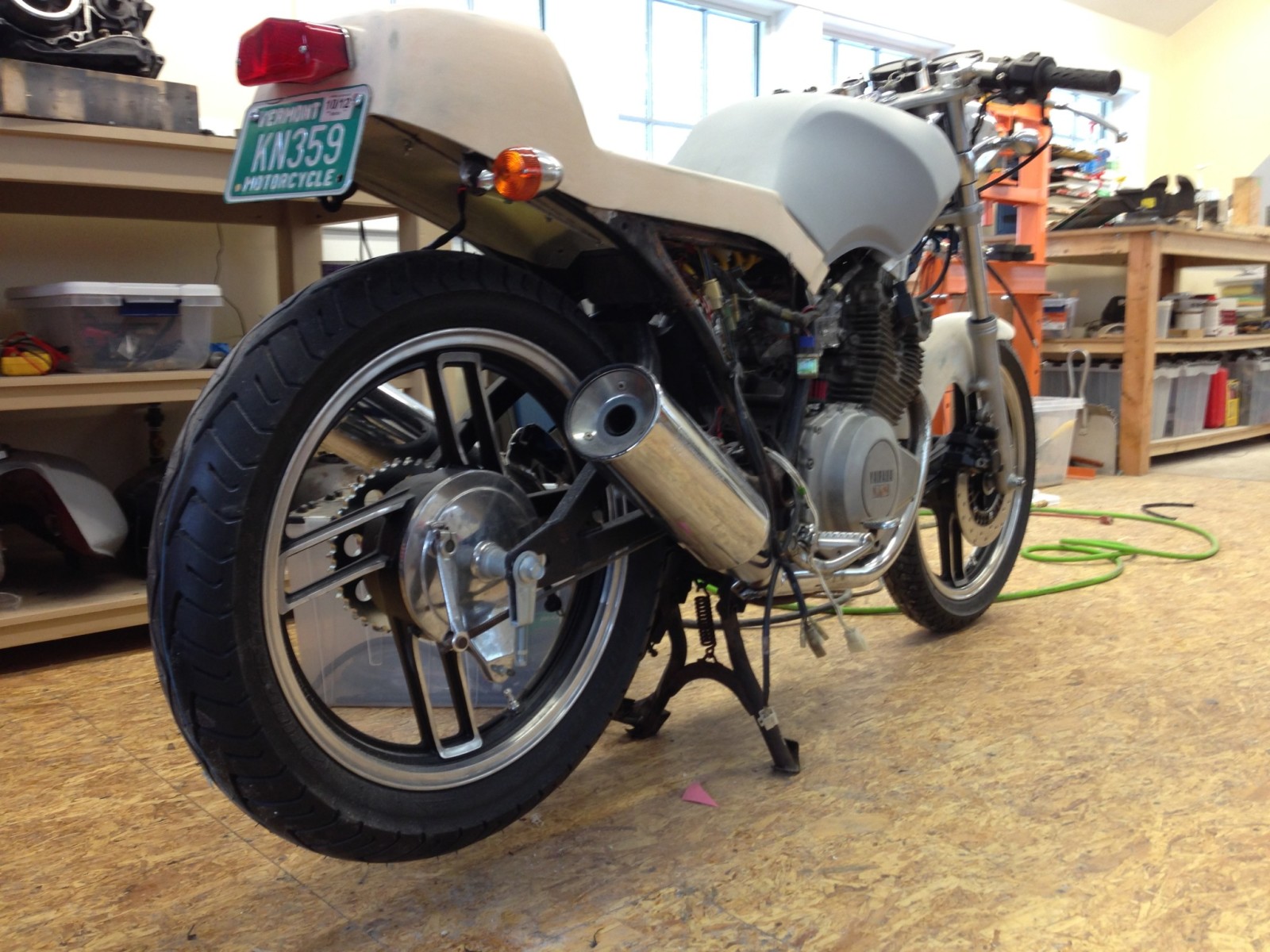
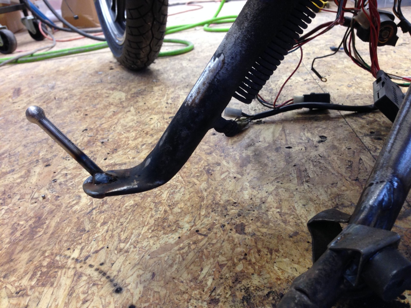
I love center stands and would never remove one from a daily rider. They make any maintenance easier. On this bike, both the center and side stand needed work.
Center stand before relocating the "foot arm" to make it line up with the crease in the muffler designed to accept the "foot arm".
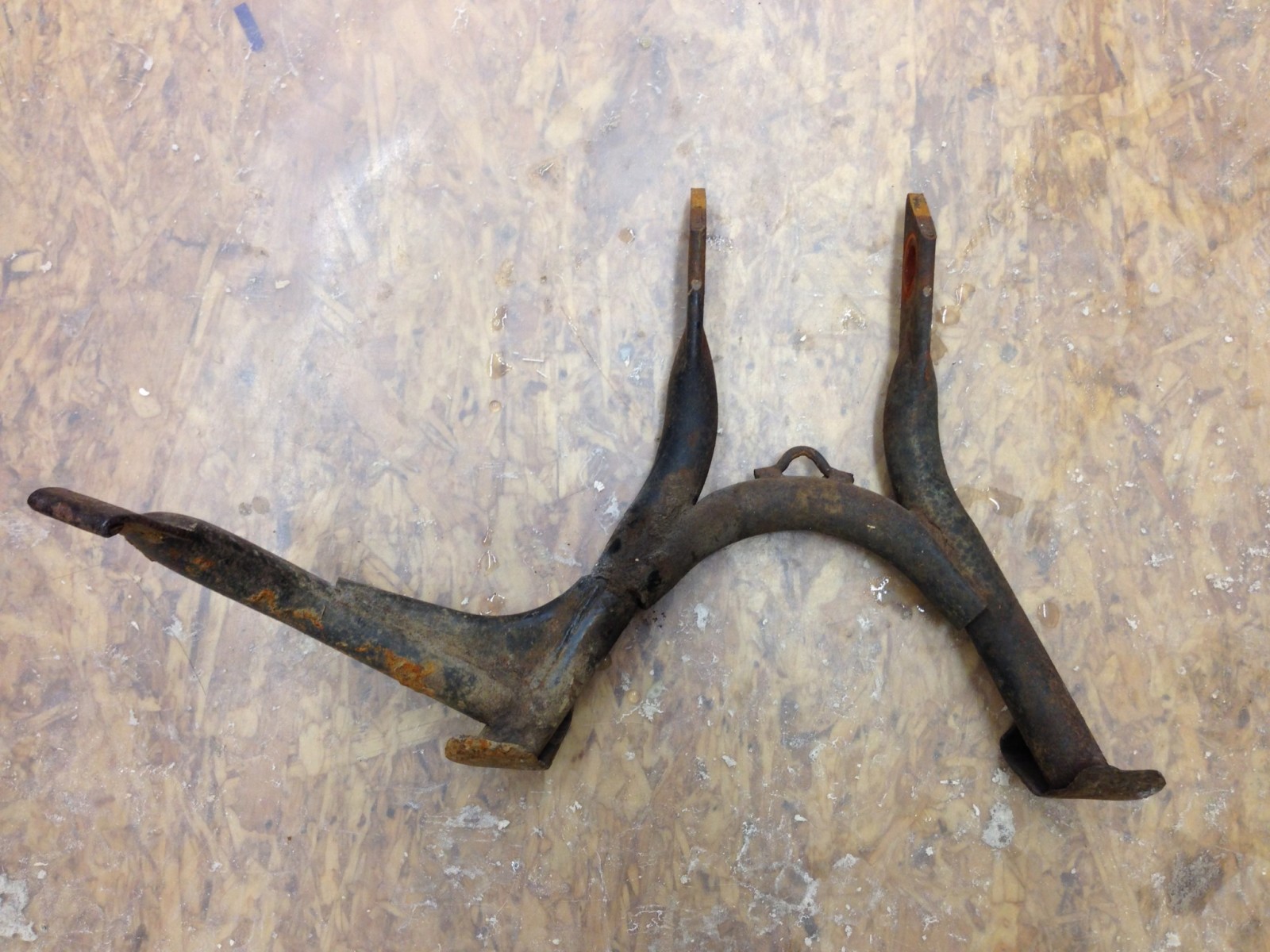
Center stand with the repositioned "foot arm".
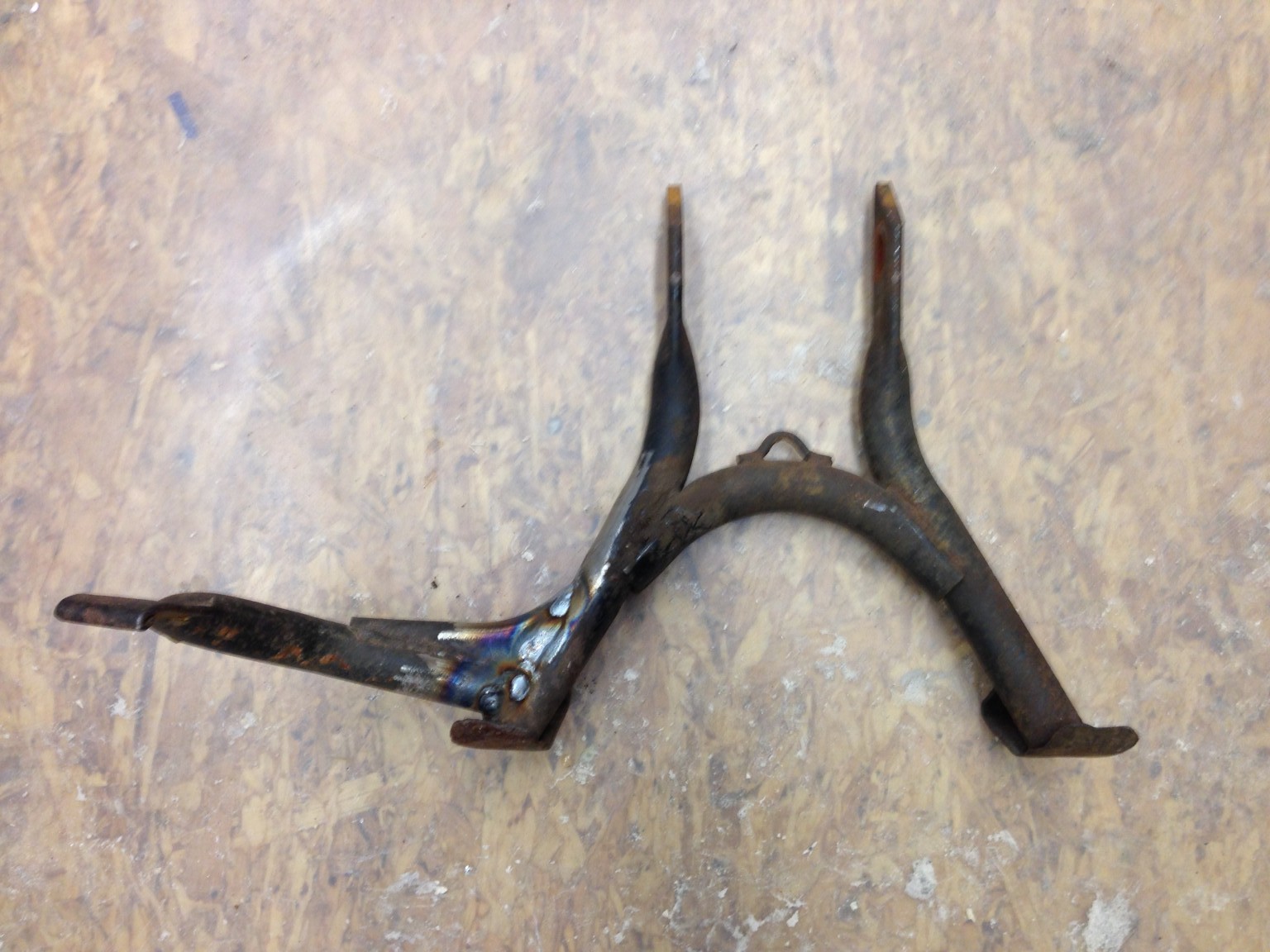
New stop welded onto the center stand.
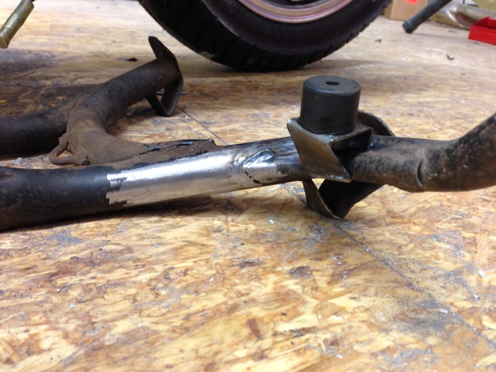
New center stand stop and and existing meeting point on the left muffler.
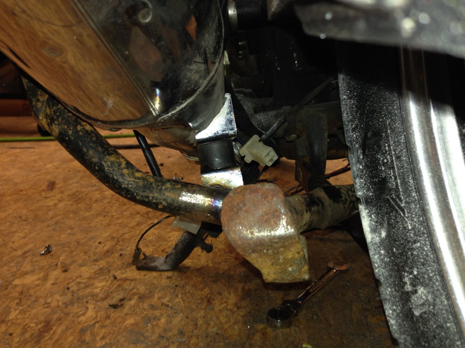
New toe kick for side stand. The original one was missing.
Center stand before relocating the "foot arm" to make it line up with the crease in the muffler designed to accept the "foot arm".
Center stand with the repositioned "foot arm".
New stop welded onto the center stand.
New center stand stop and and existing meeting point on the left muffler.
New toe kick for side stand. The original one was missing.
Looks great! Had to go back a few pages - I had forgot how much work you have in the rear fender. Do you have this fastened to the tail section in any way? Nice work on the seat fastening. I have always done the opposite - bury some threaded plates into the glass structure of the pan and bolt on from underneath - same difference. Nice attention to detail on the stands - something commonly badly re-engineered or overlooked entirely. Great to see attention rightly paid to important details. Keep up the great work - you will have a really nice unique bike you rarely see appreciated.
hdscarbro
Active Member
Thanks. Your drawing helped a lot in getting the seat to look good.
The fender and seat are not attached. The fender is two pieces. The front part is plastic and was made by trimming the tail from the original OEM fender. The fiberglass fender tail is shaped in front to lap under the back of the plastic front part. The two halves of the fender are held together with three bolts. In addition to being attached in front to the plastic part of the fender, the tail attaches to frame cross member in two places.
It never occurred to me to embed threaded plates in the seat base. I can see how that might be better in that there are no threads sticking out to get damaged when the seat is off.
jpmobius said:Looks great! Had to go back a few pages - I had forgot how much work you have in the rear fender. Do you have this fastened to the tail section in any way? Nice work on the seat fastening. I have always done the opposite - bury some threaded plates into the glass structure of the pan and bolt on from underneath - same difference. Nice attention to detail on the stands - something commonly badly re-engineered or overlooked entirely. Great to see attention rightly paid to important details. Keep up the great work - you will have a really nice unique bike you rarely see appreciated.
Weldangrind
Quae nocent, docent
Really nice work on the stands and the seat. The seat flows beautifully into the tank.
hdscarbro
Active Member
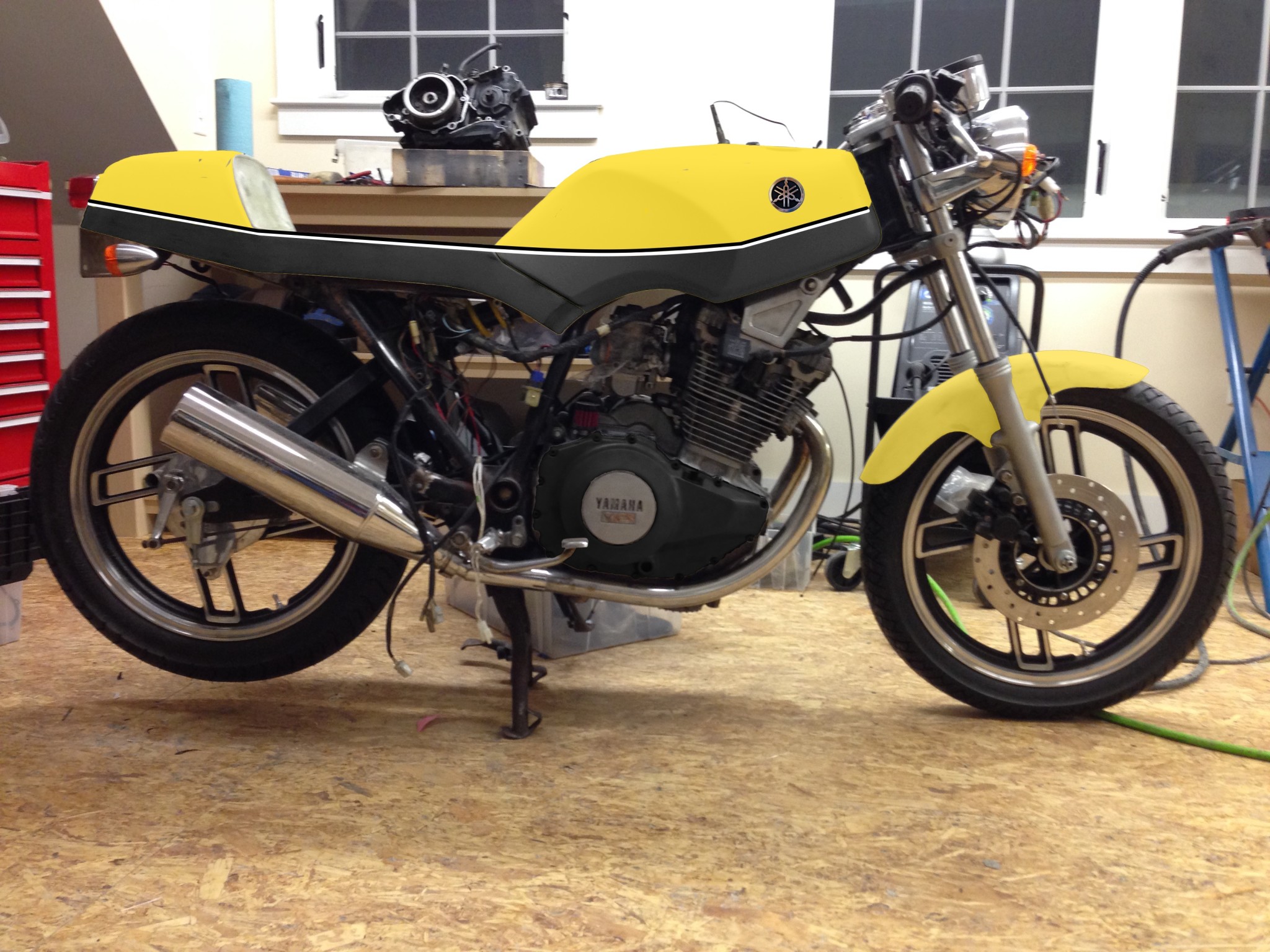
I'm starting to think about a paint scheme. Here's the first one that I've come up with. WDYT? Any other ideas?
The yellow/black transition line follows the base of the seat going forward and gently arcs to the creased "corner" on the tank, it then follows the crease to the front of the tank.
I haven't drawn it yet, but there'd also be a wide black stripe down the center of the tank and tail with same thin black and white border stripes as on sides of the tank. The frame and tank will be gloss black. The engine satin black with polished fins like some of European XS400 Seca models.
I think the two tone looks pretty good like you have it drawn, but have a couple of thoughts. First, it will look a lot different when you have a seat, both because the contours of the seat will have an overall effect on the look of the bike, and because if black, will have an impact on the design of the paint if you indeed use black - especially if black seat and black paint meet as they will with your design - your visual edge will be impacted. The other thing is that with the fairly horizontal boundary you have, and being black on the bottom, the unique shape of the bottom lines of your bodywork are visually neutralized - your eye being more impressed with the much stronger horizontal line and sharp color contrast of the two tone. I might consider making an effort to capitalize on the shape of the bodywork, but the unusual shape may take some doing. Lastly, two tone paint schemes tend to look good with sort of a 2/3 rds to 1/3 rd area ratio which is one reason why your current scheme looks good. Be careful adding another stripe down the center as it will have a big impact on balance. You don't see it looking just from the side or top, but in real life you never see your bike that way.
hdscarbro
Active Member
Thanks, I appreciate your insight. I'm planning to get the seat covered before painting the bike and am planning to have it done in with black vinyl.
Other thoughts:
1) Reverse the colors and make the bottom yellow. This'll make the tank shape appear more prominent.
2) Have the color change line follow the ridge around the knee dent.
3) One of the European XS400's had a swoosh that followed the knee dent. It was almost certainly a decal and
probably not a feasible paint design.
I'll have to take a stab at an off angle rendering, getting the perspective right for stripes will make this harder.
jpmobius said:I think the two tone looks pretty good like you have it drawn, but have a couple of thoughts. First, it will look a lot different when you have a seat, both because the contours of the seat will have an overall effect on the look of the bike, and because if black, will have an impact on the design of the paint if you indeed use black - especially if black seat and black paint meet as they will with your design - your visual edge will be impacted. The other thing is that with the fairly horizontal boundary you have, and being black on the bottom, the unique shape of the bottom lines of your bodywork are visually neutralized - your eye being more impressed with the much stronger horizontal line and sharp color contrast of the two tone. I might consider making an effort to capitalize on the shape of the bodywork, but the unusual shape may take some doing. Lastly, two tone paint schemes tend to look good with sort of a 2/3 rds to 1/3 rd area ratio which is one reason why your current scheme looks good. Be careful adding another stripe down the center as it will have a big impact on balance. You don't see it looking just from the side or top, but in real life you never see your bike that way.
RoyalRider
2010 Royal Enfield Bullet 500 - 1982 Honda CB125s
Sorry for not really adding anything useful to the convo but I just had to thank you OP for the great fiberglass photos.
I used to work with fiberglass repairing sailboats when I instructed for the local club and I didn't think of making fiberglass copies of my fenders. Thanks to your pics I have a nice little guide on how to make some.
If it's worth anything I agree with JPMobius about the paint scheme...less is more. I wouldn't put anymore stripes or swooshes like you're thinking and would stick to the mock up you provided. IMO that type of canary yellow looks great with anthracite grey.