We noticed you are blocking ads. DO THE TON only works with community supporters. Most are active members of the site with small businesses. Please consider disabling your ad blocking tool and checking out the businesses that help keep our site up and free.
You are using an out of date browser. It may not display this or other websites correctly.
You should upgrade or use an alternative browser.
You should upgrade or use an alternative browser.
DTT logo for Detroit/MI
- Thread starter JS550
- Start date
JS550
Been Around the Block
Ofcourse, it would be in the circle with the "DotheTon" @ the top & I thought just the old english "D" @ the bottom would be cool. The RenCen is an obvious land mark & I think Joe Louis' fist was a good strong one to use. Kinda tough. Needs a lot of cleaning up still, my scanner isnt working so I had to go a round about way & only have paint on my pc. BUT, its a 1st draft.
locOleoN
Is that the best you got? OK.. now my TURN...
JS550 said:Yea I wanted to thicken the lines up, but couldnt figure it out other than free hand on my pc. Im still messing around with it.
Looks pretty good so far...
Hows about raising up the rider up towards the center of the circle? Then putting "Michigan DTT" along the top outside the circle and "TERRORS" along the bottom in a totally different font.. similar to what the DTT West end boys did...Just a thought...
How about putting the rider higher up in the circle with Rolling Dice to the side.. like in the picture of the Lucky 13 patch
I like the logo with the ren cen and fist. I really like the fist, since it's strong, local, and calls up the city's wrenching history. But if you have to change it for the patch, maybe just the rider under the ren center would be cool, since it would look like blasting through the city.
I've got one worked up for a statewide patch as well, but I've got to get the text bent for the outer ring. I'll post it up tonight one way or another.
I've got one worked up for a statewide patch as well, but I've got to get the text bent for the outer ring. I'll post it up tonight one way or another.
locOleoN
Is that the best you got? OK.. now my TURN...
JS550 said:Im gonna rework it, try to move the rider up like loco said & maybe put the rencen & fist over the shoulders. Ill post it soon.
jim
Cool.. once you guys give me the thumbs up on the design, its gonna go in the 1st edition DTT Book to be printed forever and ever in cafe racer history...
locOleoN
Is that the best you got? OK.. now my TURN...
JS550 said:That looks really cool. Maybe put Michigan @ the bottom insted of cafe racers? Im still gonna make up a D town one, but that would be great for a state wide one.
+1 I like the idea of having Michigan along the bottom
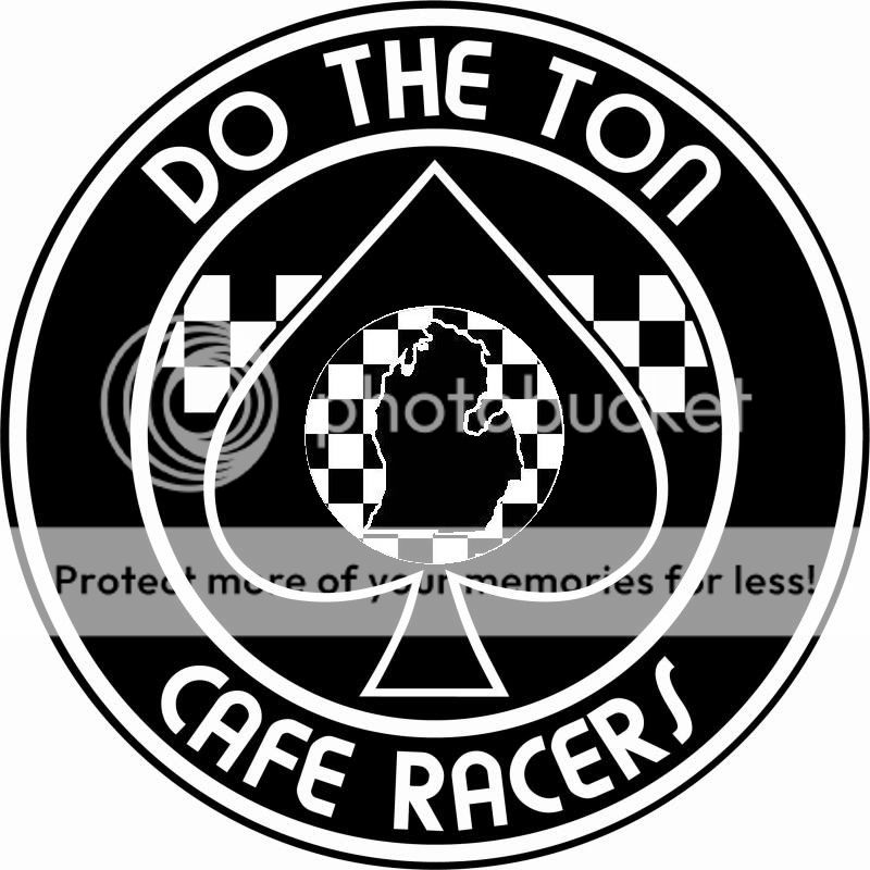
Should we include the UP in the logo? I left it off of my version in the "colors" thread, but that was just because the lower peninsula looks sort of like a spade on its own. This version has the spade as well, so maybe we shouldn't leave out the yupers? I don't know if there are any DTT folks up there or if its just us trolls around here.
Just a thought
Dan
Just a thought
Dan
")
Well, here's a version of the statewide logo I had been working on with the UP. For whatever reason the outline of the state ended up a bit blurry when I did this one. I've also cut out just the center part with checks and state if you want to use that in the patch you've worked up without having to cut it out again. If you like it and it still seems too blurry, I can try to sharpen the edges a bit more and repost it.
dp
dp
locOleoN
Is that the best you got? OK.. now my TURN...
dont mean to be a wet rag but I think all the checks in the middle is a bit busy.
From a design/manufacturing standpoint, there may not be enough black-space to show the contrast between the checks and the state outline.
All that white may all "blend" into a white ball when its made in a patch, especually if you guys want to have a 3 inch or 4 inch version of the patch made.
Id suggest removing the checks in the middle and putting a symbol instead. Then Id put "MICHIGAN" along the top above the patch as a seperate banner patch then along the bottom put "Dirty Glove Division" or "TonUp Terrors" or something like that along the bottom in a seperate banner patch similar to what the DTT west-end boys did
just a thought...